Bally's Sports Betting Terminal
Bridging the Ballyverse — designing the physical-digital touchpoint that unified Bally's mobile ecosystem with the casino floor across 19 resort properties.
Context & Stakes
Bally's was in the middle of an aggressive omni-channel push called the "Ballyverse" — a strategy to collapse the boundary between their mobile apps and the physical casino floor. The Sports Betting Terminal was the missing physical node in that strategy. Without it, a player who built loyalty points on their phone had no way to feel that relationship when they walked into a resort.
The business pressure was real: competitors were deploying kiosks faster. If the terminal felt like a generic hardware product rather than a coherent extension of the Ballyverse brand, the entire mobile investment would lose its anchor.
The constraint stack was unusually complex for a software project: hardware vendor (Suzohapp) with fixed physical dimensions, ADA and WCAG 2.1 compliance requirements, casino regulatory approval, strict security SOPs for casino operations, and a committed 19-property rollout timeline.
Key Insight
The terminal wasn't just a product — it was a proof point for an entire company strategy. If the Ballyverse vision was going to be credible to investors and partners, this hardware had to feel like it belonged to the same ecosystem as the mobile app.
My Ownership
I was responsible for the end-to-end UX direction across both the player-facing experience and the staff operational interface. This included: hardware ergonomics specification in collaboration with Suzohapp, the full prototype suite in Figma and ProtoPie, the redesign of the staff maintenance dashboard, the accessibility audit and ADA alignment, and the "Living Demo" used to secure executive buy-in.
The Problem, Reframed
The brief I received was: "Design a sports betting that integrates with Bally's experience."
The actual problem was: "Design a system that works simultaneously for three very different users — the player standing in a noisy casino, the operations staff who maintains it multiple times a day, and the executive whose budget approval depends on believing this investment will hold up across 19 properties."
Key Insight
What I chose NOT to solve: full feature parity with the Bally's mobile app. Replicating every mobile feature on a terminal would have produced a shrunken phone experience — not a venue centerpiece. The terminal needed to do fewer things more confidently, not everything at lower quality.
Key Decisions
Solutions
01 — Hardware UX
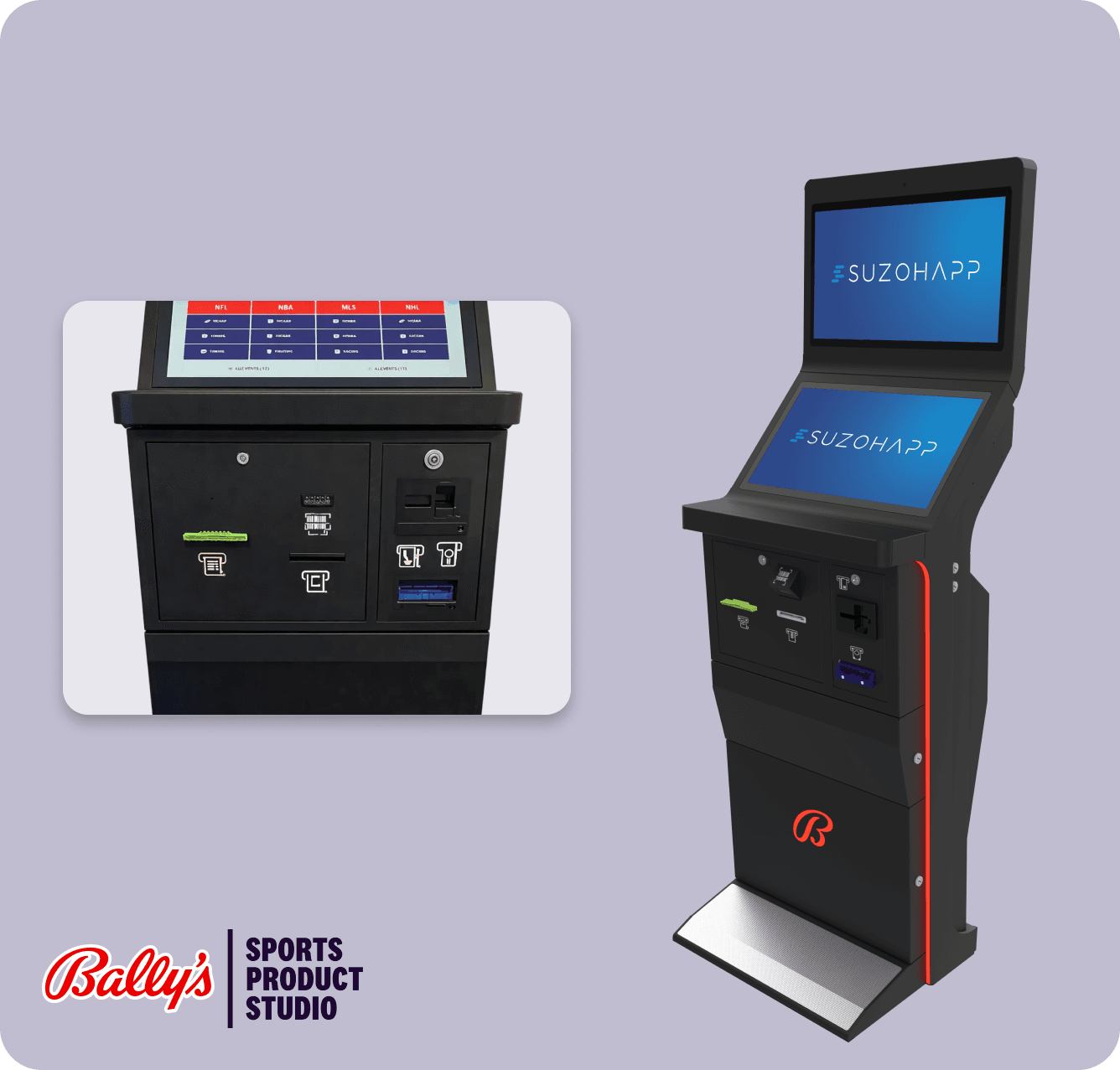
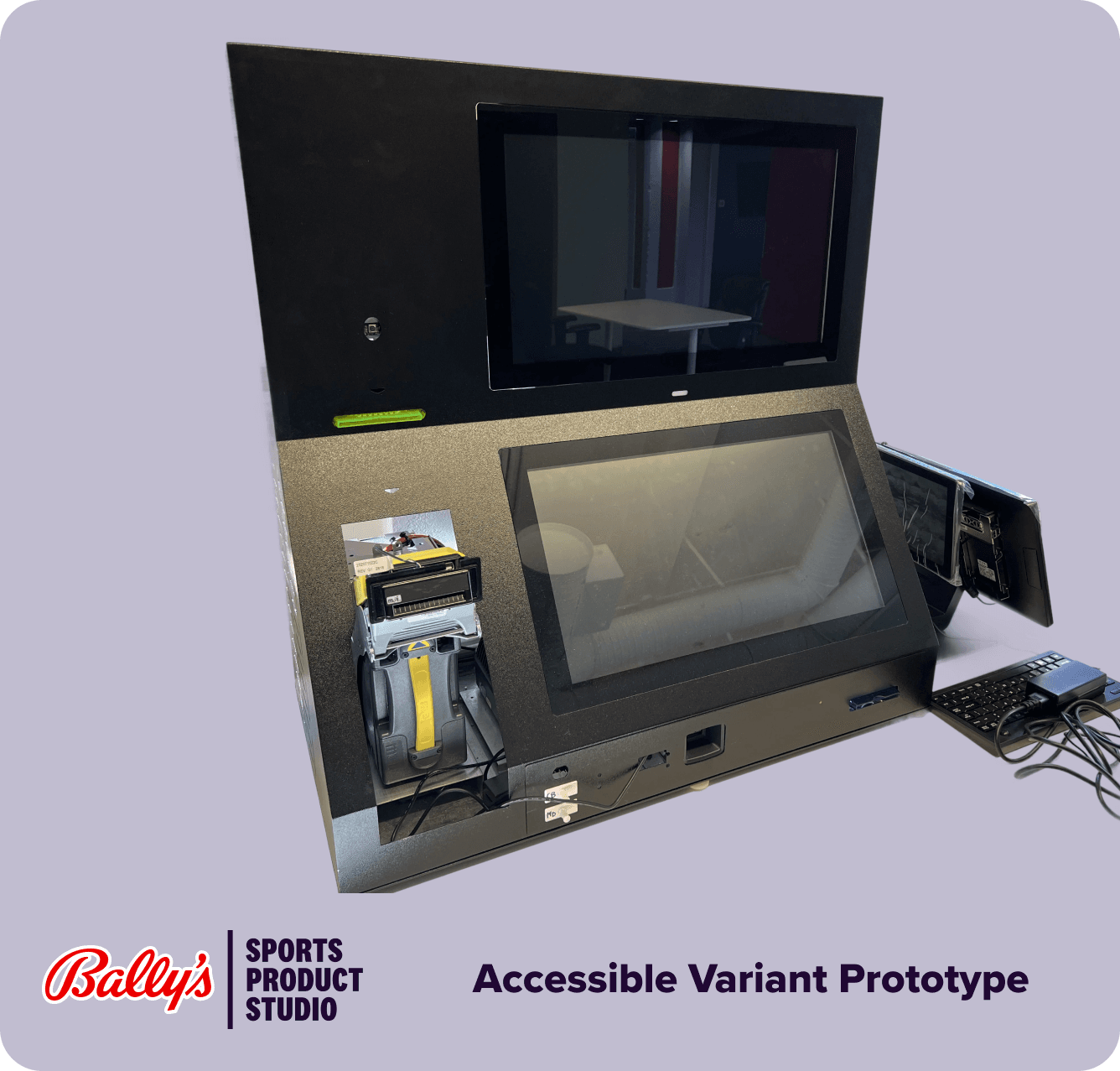
The hardest constraint in this project wasn't the UI — it was that every screen decision had a physical hardware dependency, and every hardware dependency had a regulatory constraint.
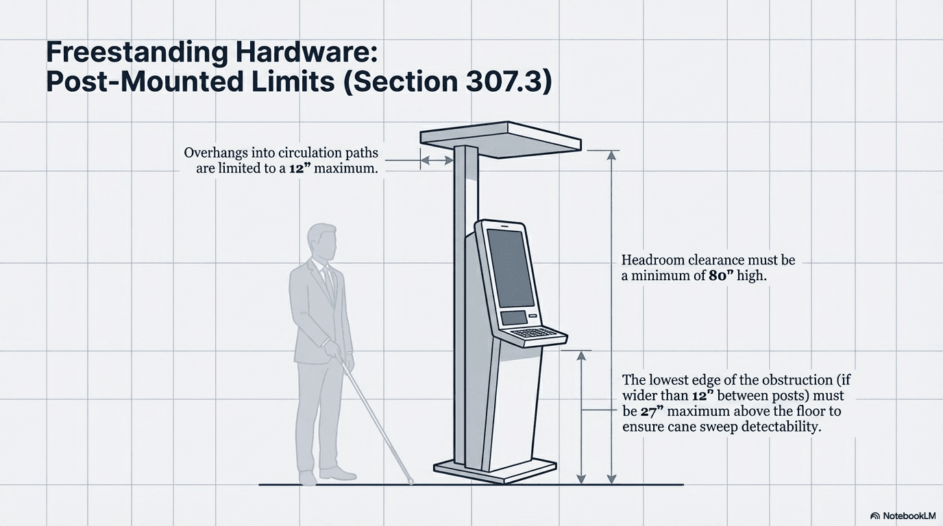
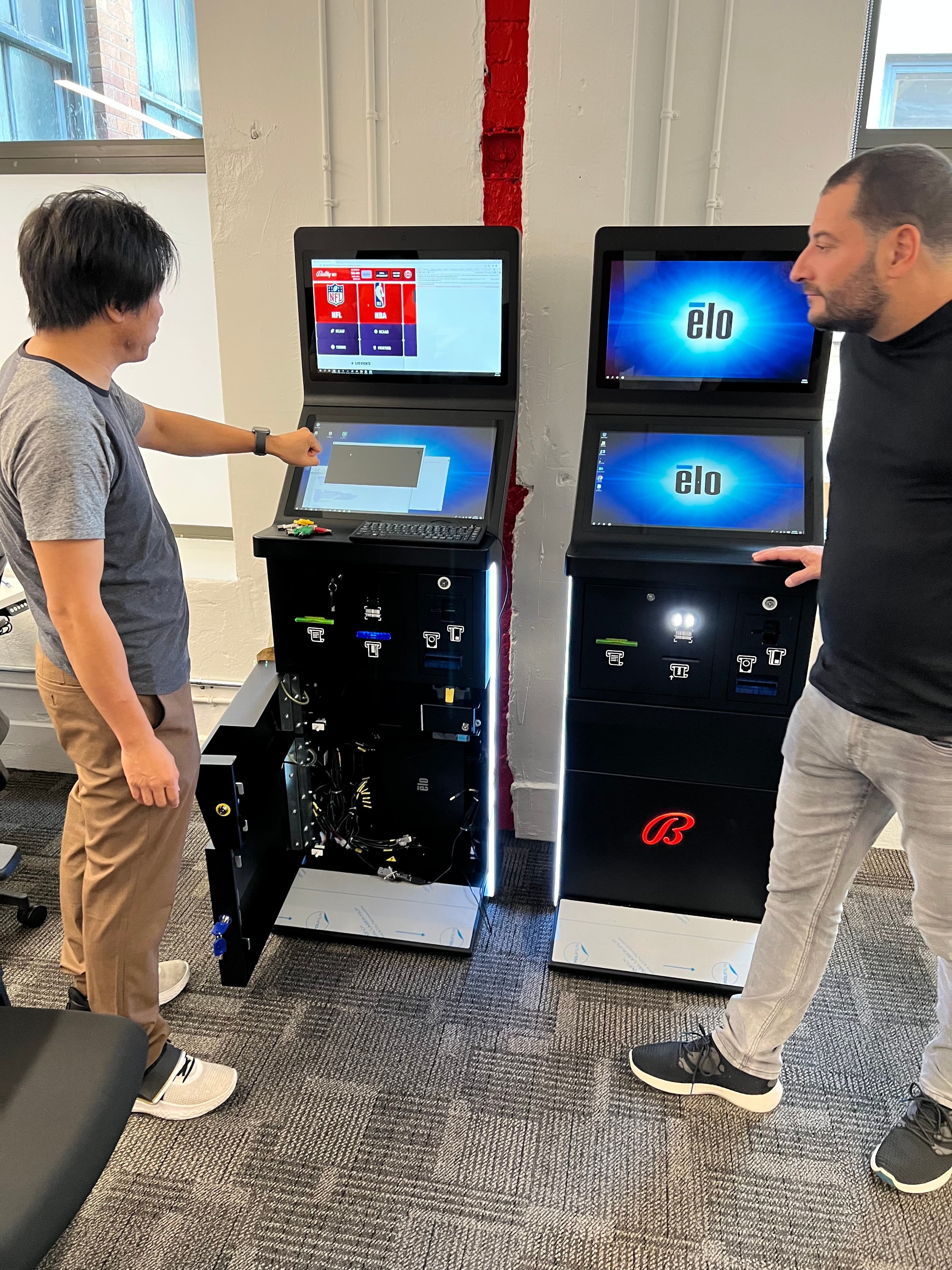
Working closely with the PM, I incorporated ergonomic design principles and ADA compliance standards into the hardware design brief — then translated those physical decisions into software UI and UX that maximised the hardware's form for a seamless, ergonomic, and accessible product experience. ADA and WCAG 2.1 alignment were designed in from the start, not retrofitted.
The result: peripheral placement, screen angles, and interaction zones that work for a wide range of player heights and physical abilities — with a software layer that feels native to the hardware rather than bolted on top of it.
02 — Operational Excellence
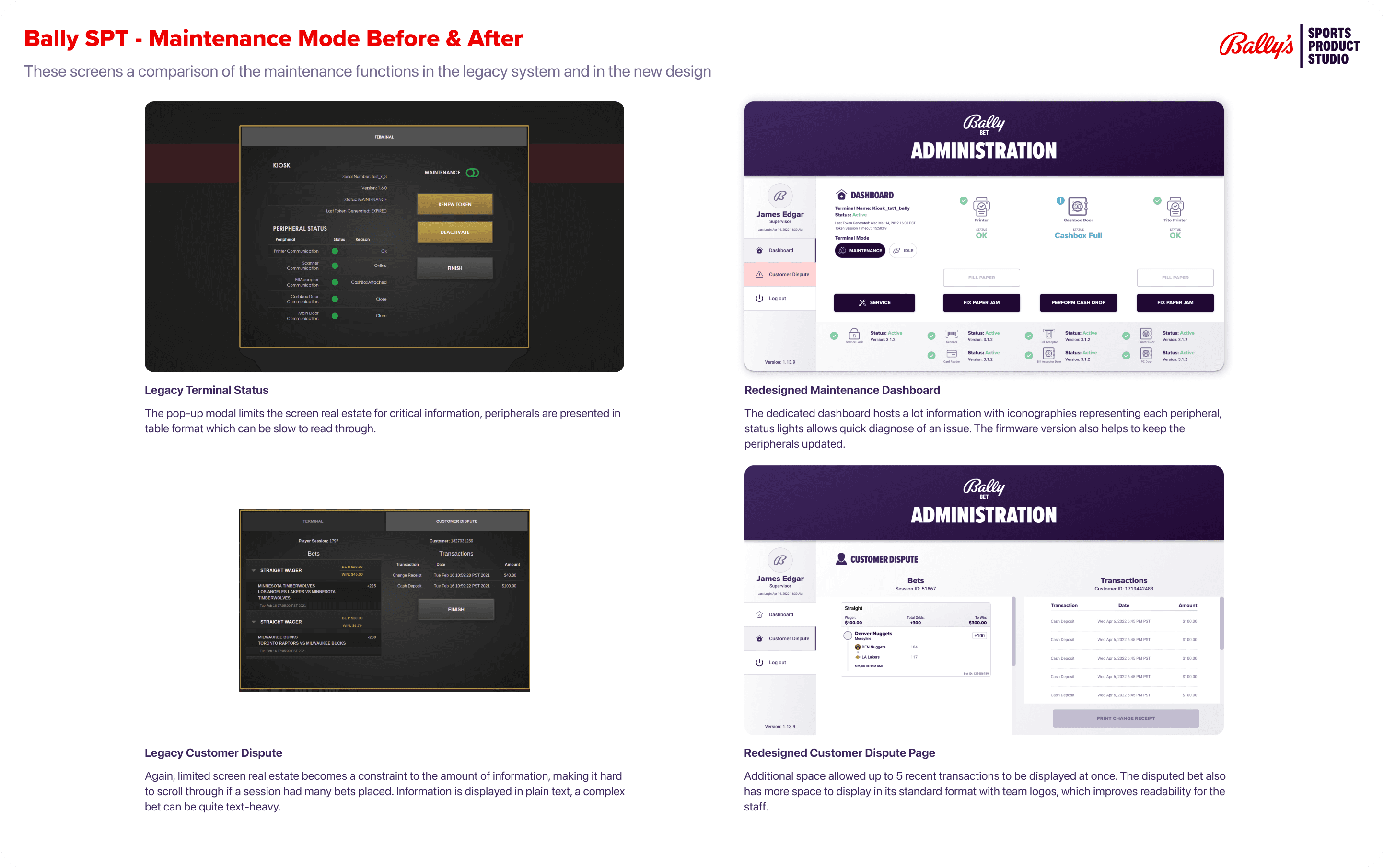
A terminal deployed across 19 properties is only as good as the staff who operate it. Through qualitative interviews with Bally's casino floor staff, I learned something that hadn't been in any brief: a staff member responsible for terminal operations required 80 hours of training to reach proficiency. They managed cashbox changes, paper reloads, TITO jams, and issue escalation — all while following strict security protocols — multiple times per shift.
The redesigned staff dashboard collapsed the most common issues into a single "status at a glance" view: printer paper level, cashbox capacity, active errors, and network state — all visible before any deep navigation. The 90% daily task coverage target was validated directly with ops staff.
Quote
"I used to have to go three or four screens deep just to check if the printer needed paper. Now I can see it the second I open the maintenance panel." — Casino Operations Staff, Research Interview
03 — Player Experience
The player-facing terminal UI was designed to echo Bally's digital mobile products — not replicate them. Shared design language (typography, colour, iconography) made the transition from mobile app to physical terminal feel like a natural extension of the same ecosystem.
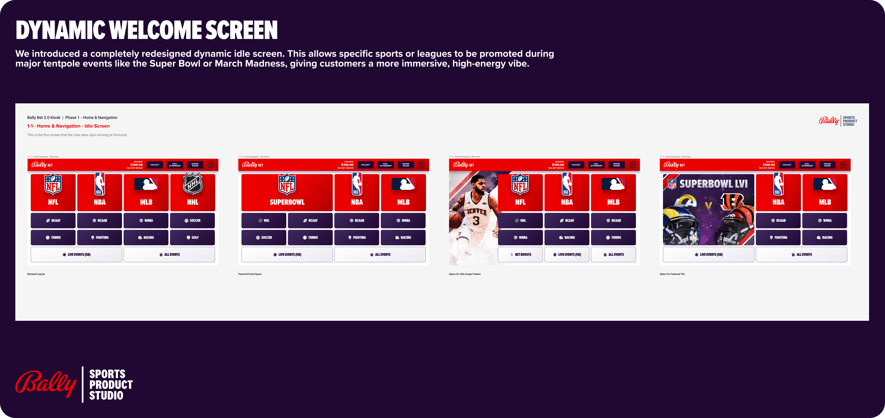
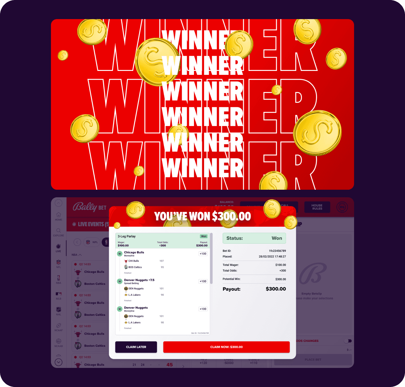
A completely redesigned dynamic welcome screen allows sports or leagues to be promoted during tentpole events. Custom animations were introduced for key hardware interactions: ticket printing, card scanning, and winning results — each with timing calibrated to the actual hardware response latency, so the digital feedback feels physically connected to what the machine is doing.
04 — Prototype as Strategic Tool
I'm a loud advocate for high-fidelity prototyping as a communication and risk-mitigation tool. I built a single Figma prototype that served two distinct audiences at once.
For executives — a fully interactive Living Demo of the player experience, used to present the product vision before a line of code was written. It secured buy-in and budget approval in a way no spec document could: stakeholders experienced the product rather than reading about it.
For engineering — the same prototype doubled as an interactive PRD, with annotated specs linked directly to the flows. By simulating complex hardware interactions — scanner feedback, ticket-out animations, winning states — the team had a functional reference that eliminated ambiguity and reduced costly rework during the build phase.
05 — Loyalty & Personalisation
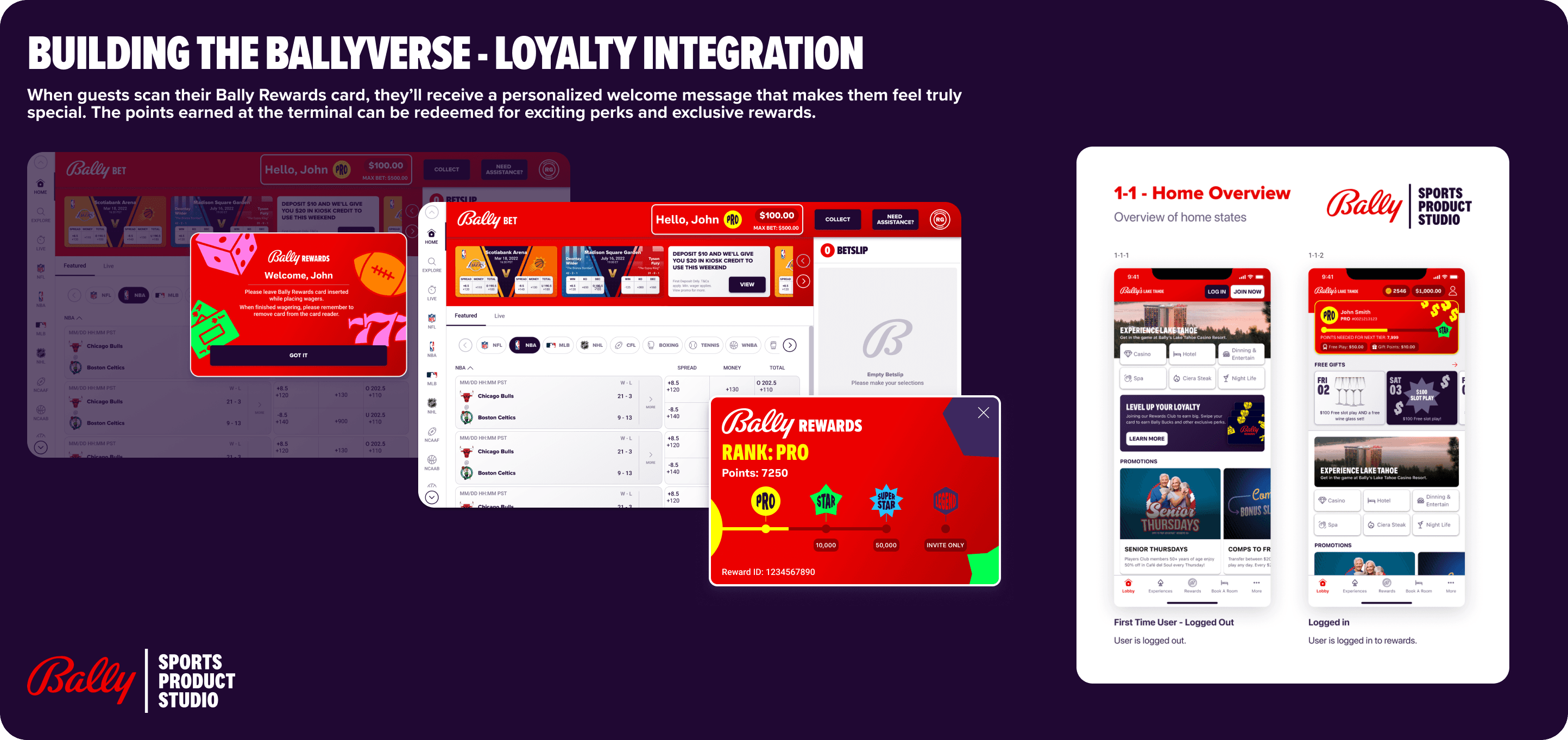
The Bally Rewards integration was the detail that made the terminal feel personal rather than transactional. When a player scans their loyalty card, they receive a personalised welcome — their name, their tier, their current points balance. Points earned at the terminal feed directly back into the same rewards ecosystem as the mobile app.
This closed the Ballyverse loop: the same player identity, rewards, and brand personality existed whether you were betting from your couch or standing on a casino floor.
Cross-functional Influence
Executive alignment — The ProtoPie Living Demo replaced a 40-page written specification as the primary communication tool for executive stakeholders. Buy-in and budget approval for the 19-property rollout were secured through a prototype session, not a document review.
Engineering alignment — The interactive PRD served as a functional specification for the Manchester development team. By simulating hardware interaction timing in Figma and ProtoPie, I removed the most common source of spec ambiguity (what does "good" feel like for a hardware response?) before the build phase began. This measurably reduced rework cycles.
Operations alignment — Four dedicated qualitative research sessions with casino floor staff directly shaped the scope and priority order of the staff dashboard. The 90% daily task coverage threshold came from this research, not from an internal assumption.
Outcomes & Impact
The terminal was deployed across all 19 Bally's resort properties and became the physical centrepiece of the Ballyverse strategy.
- Staff dashboard enables 90% of daily operational tasks without escalation — reducing training overhead and floor downtime across the entire portfolio
- ADA/WCAG 2.1 compliant — the first terminal in Bally's physical gaming portfolio to meet this standard
- Executive buy-in secured via prototype — the Living Demo approach has since been adopted as a standard practice for hardware/software R&D projects across the team
- Ballyverse continuity delivered — the loyalty integration created a measurable link between mobile engagement and terminal usage for the first time
Reflection
If I were doing this again, I would instrument the prototype testing phase earlier — specifically for the staff-facing flows. We validated the player experience heavily in ProtoPie, but the staff dashboard was tested primarily through research interviews rather than interactive prototypes. A high-fidelity staff prototype would have surfaced edge cases in maintenance workflows earlier in the process.
The broader lesson this project taught me: any product that has an operational surface — a staff portal, an admin dashboard, a CMS — has a "silent user" whose experience directly determines whether the customer experience is possible at all. I now apply that lens to every product I work on.